What Is Responsive Web Design?
One Flexible Website for Every Screen Size
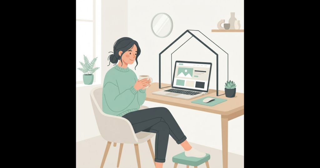
Responsive web design means your website automatically adjusts its layout, images, and fonts to fit any screen size. Whether a customer browses your site on an iPhone in Garden City or on a widescreen desktop computer in Patchogue, the content reshapes itself cleanly. There is no need for a separate, secondary mobile site or confusing layout shifts.
This seamless adaptation ensures that text remains easy to read and navigation buttons stay simple to tap without pinching or zooming the screen. Every visitor enjoys a polished, professional experience regardless of their preferred device.
A single flexible website also simplifies updates. When you change your phone number, business hours, or service descriptions, those updates appear instantly across all screen sizes.

Why Search Engines Demand Mobile Responsiveness
Search engines index websites based primarily on their mobile versions. If your site displays tiny unreadable text or broken elements on smartphones, your search rankings across all devices will suffer. A responsive layout protects your search presence and keeps mobile users engaged.
When a site is not responsive, mobile visitors leave quickly out of frustration. High drop-off rates signal to search engines that your site is not meeting customer expectations.
Delivering a smooth mobile experience keeps visitors browsing longer, which signals to search engines that your business provides valuable, user-friendly information.

Preventing Common Layout and Usability Problems
Non-responsive sites often suffer from misaligned forms, overflowing text boxes, and oversized images that slow down page loading. Ensuring your design elements fluidly resize maintains a professional image for your business across every device.
Thumb-friendly buttons, clear navigation menus, and readable font sizes make it easy for prospective clients to get in touch while on the go.
If you want to update your site with modern responsive features, check out our Suffolk County web design solutions tailored for local growth.
Is your current website frustrating mobile visitors on small screens? Contact Hauben Media today to build a fast, responsive site.
Hire Me
Hauben Media builds websites and marketing campaigns that help local businesses win more customers. Get a free, no-pressure quote today.
Contact Us for a Free Quote