All the marketing and ads in the world won’t help your company if you’re not on-brand throughout everything you do.
Being on-brand means using a consistant set of fonts, colors, and designs throughout your website, ads, and other marketing materials. Sticking to a style guide like this will make sure your ads seem cohesive with your website, which will increase online conversions – customers will more easily remember your brand if you use the same consistant imagery style.
It also creates the best experience possible for your users. Its weird when you click on an ad and then you’re brought to a website that looks like a completely different product/company.
Luckily, creating a style guide for your company is pretty simple.
CREATING A STYLE GUIDE FOR YOUR STORE
All you’re doing here is coming up with a nice set of design elements that your team can use in your online and in-store presence. These are the things I like to consider when creating a style guide:
COLORS
The first thing I usually do is decide on the brand colors. I open up Photoshop and place 3 boxes side by side, with the first box being bigger than the other two (this helps me distinguish the main color vs the accent colors). Usually choosing the primary color is the most difficult part – once you’ve chose that, choosing the accent colors becomes fun. But that’s probably just me being a design geek.

HEADING FONT
Once you’ve figured out your brand colors, the next step is choosing your fonts. Sometimes you may decide to start with choosing fonts before your colors depending on any ideas you have in your head.
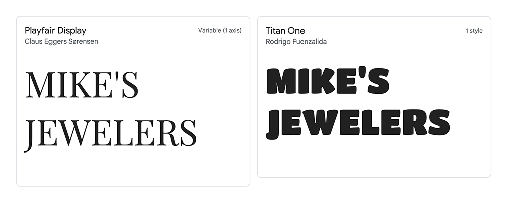
Your font choice is a HUGE decision. The font alone will set the tone for your brand’s image because it will be used in your logo and throughout the headings on your website. Look at these two pictures below… see how different the company appears just from the font change? One logo looks like a jeweler’s logo, while one looks like its a logo for a subway stop.
Visit fonts.google.com to browse Google’s huge font collection.
BODY FONT
After you’ve decided on the primary font, you’ll need to choose a secondary font to use in the main text of whatever you’re doing. This font should be used as the “body” text of your website, as well as be used throughout all your ad imagery.
Just like the primary font, the secondary font plays a big part in how your imagery is perceived. Looking at two fonts side-by-side may not reveal the differences between the fonts. So I tend to look at a couple paragraphs of text for each font so you can really see how different they are. Check it out:
FONT 1
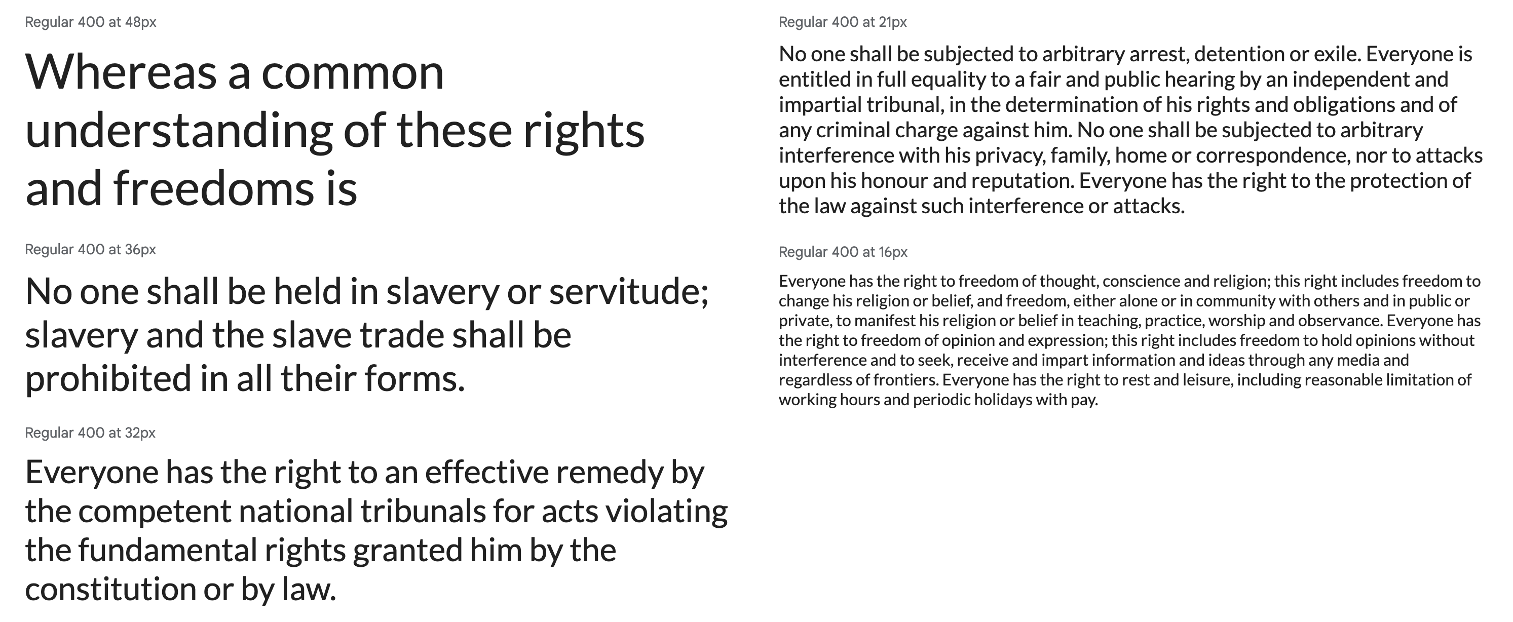
FONT 2
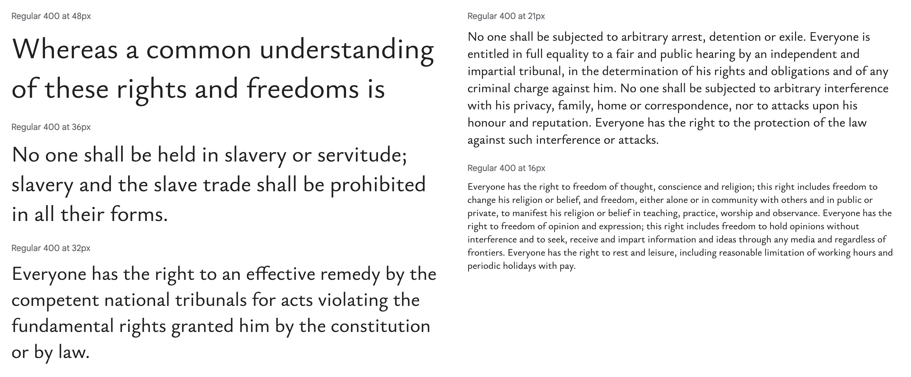
Choosing a body font that looks nice with your heading / primary font will give you that polished look.
MISC DESIGN ELEMENTS
You may have some kind of cool design element you want to use throughout your branding. For one of our trade shows, we use a series of wavy lines I designed, and I incorporate those wavy lines into all our ads and show signs. Using a subtle little design element like this can help tie all your branding together with a bow.